Ludic Lift
An elevator retrofitted with a personality that responds to its usage to discourage lazy behaviour
Key technologies

Arduino

Wave Shield

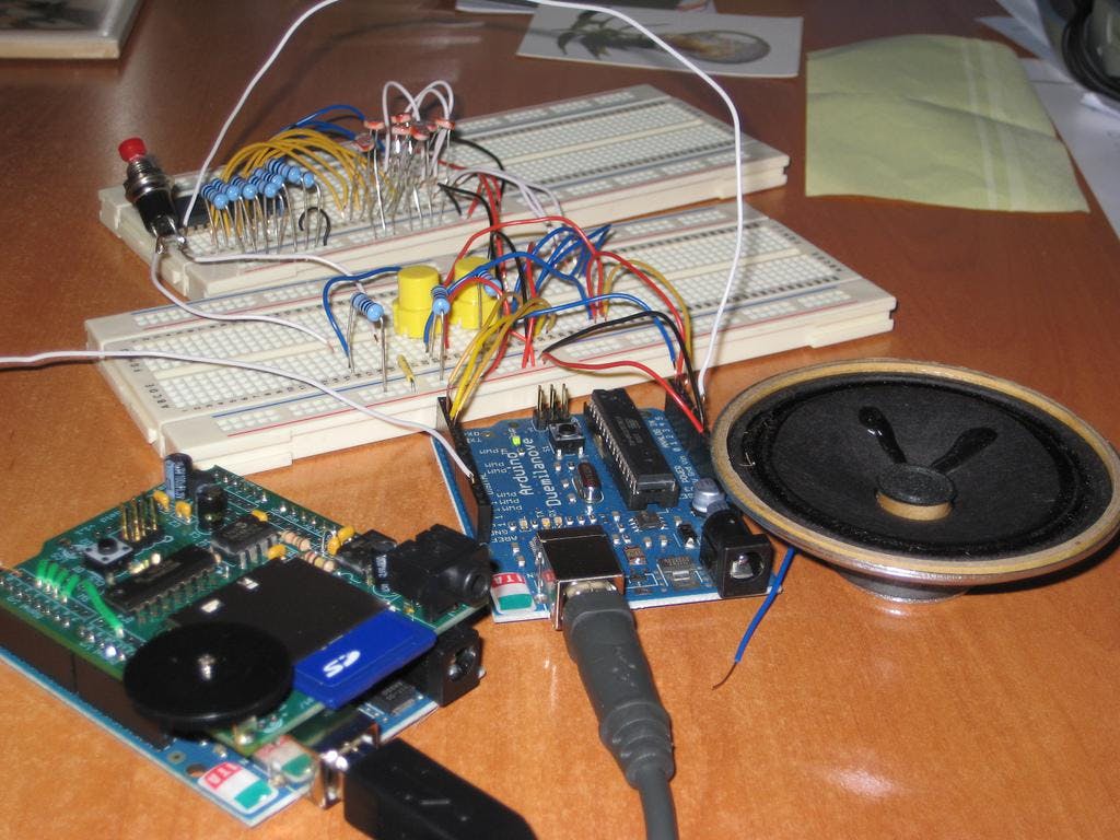
Electronics

HTML5
Project details
Brief
Change behaviours by encouraging people throughout the university to increase their physical activity
Strategy
Encourage building visitors to utilise the stairs for short journeys instead of the elevator
Implementation
Retrofit an elevator with a personality which responds to its usage and discourages lazy behaviour
Deliverables
- Design installation
Institution
University of Queensland
Degree
Masters of Interaction Design
Product Designer
Markets
- Australia
Audience
- University staff
- University students
- Building visitors
Lifespan
10 May 2010
Overview
The Ludic Lift project encompassed two elevators situated at the University of Queensland. The project altered the physical and acoustic experience of the elevators through two personas – Elevator Barbie and Elevator Ken.

Interaction
Depending on which level participants would enter on and the level they were travelling to, the lift would either praise or scorn the passengers for their choice to use the elevator over the stairs.
If a person was to travel one floor (e.g.: from level 2 to level 3), Elevator Barbie would respond with something similar to: "Ok, I'll take you up a level – but don't tell Elevator Ken we're having a one-floor stand". Contrariwise, Elevator Barbie would seem to bounce with glee and scream excitement when travelling 6 floors (from level 1 to level 7) exclaiming "We're going to Elevator Ken's Dream House – OMG OMG OMG!"
Brief
The project being developed must encourage people to increase their physical activity when away from their office environment. Although the brief in its definition allowed for a vast amount of creative expression, the primary target audience should encompass staff and postgraduate students/residents and be situated within the university's campus.
Audience
To better understand lift and stair usage in the building, we pointed a camera at the most-used floor and the most-used stairway in the building. Our objective was to better understand how the lifts and stairs were used in the building.
We also performed a user analysis by standing in the elevator and manually recording where people entered and exited the lift. We also identified whether their reason for using the elevators was legitimate (e.g.: long passage, heavy loads).
Video by Dean Jullie
Our studies concluded that most elevator traffic was between level two and level three which caused the most congestion to the elevators.
The installations' aimed to alter the behaviour of people travelling between the second and fourth floor. We also assumed that with the constant praise of the lifts to those travelling to higher levels; they would be more welcoming of the lifts' personalities.
Development
A lo-fidelity prototype was created using a simulated environment in Adobe Flash. The prototype allowed the testing of the interaction and the possible physical problems which could arise during implementation.
However; due to a limited timeframe and delayed shipping, the total installation implementation time was 10 days; however the detailed specification for implementation allowed for a smooth construction and bump-in.
Electronics
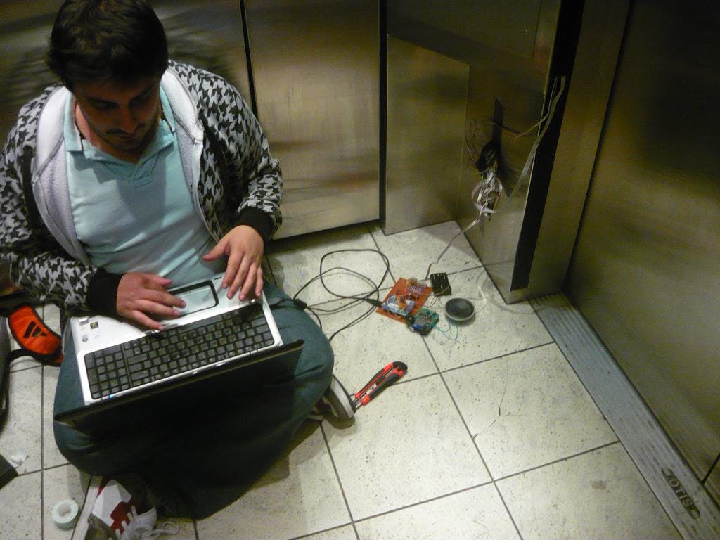
Hi-fidelity prototypes and calibration were completed in the elevator space. This proved difficult at times due to the limited space available and the requirement to ensure the elevator was not obstructing for its regular duties.
Any work which was performed in the elevator was subject to a group member getting motion sickness. For this reason, work was tested before implementing in the environment.
The implementation of the Ludic Lifts was expected to be in place for approximately 5 days. Unfortunately, public response to retrofitting the elevator with a personality meant that the total lifespan of the project was 3 hours.

Outcomes
In the three hours of the installation's running lifespan, it was found that a large majority of people who resided on the third and fourth levels were actively engaging with the lifts as they wanted to experience what the system was designed for – despite being scorned for taking short elevator journeys.
Top-floor residents were not welcoming of the lift personalities. While it was assumed that the major negative response of the elevators would be the content of the auditory feedback, most complaints stemmed from the visual appearance in the lift as "the majority of the lift's functions were covered in Gaffa tape, which reduced the professional appearance of the lifts as a means of public transport" [anonymous].

Conclusion
Despite the number of responses from people who disliked the installation, the number of people who have praised the experience was far greater.
Our analysis of the system re-enforced by the feedback received (both positive and negative) found that people were able to understand the concept of what the elevator personalities were attempting to encourage, despite their short deployment period.
Retrofitting the elevator with a new voice provided for a different means of feedback, but did not change the understanding of how an elevator functioned.
Although some people may not see a 3-hour deployment as successful, the objectives of the installation were fulfilled as the attitude towards utilising the lift for short journeys was changed.
Exhibitions
University of Queensland
St. Lucia Campus
Brisbane, Australia
Collaborators
Product Designer
Product Designer
Product Designer
Product Designer
Product Designer